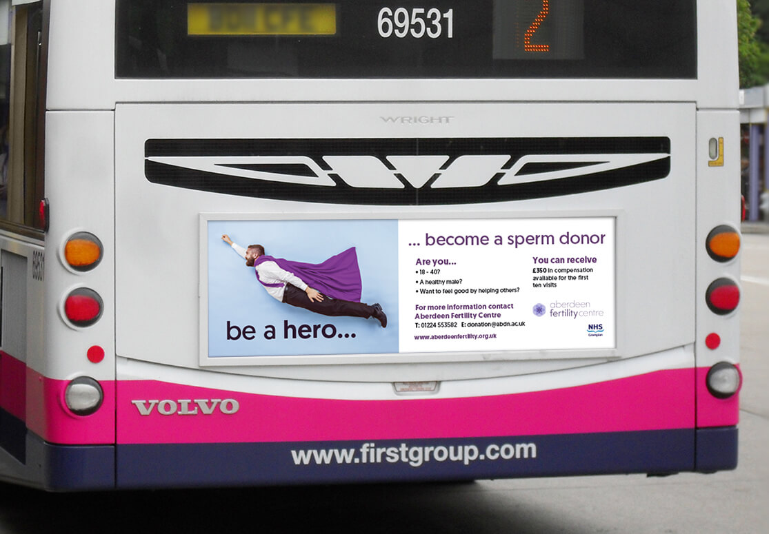
aberdeen fertility centre
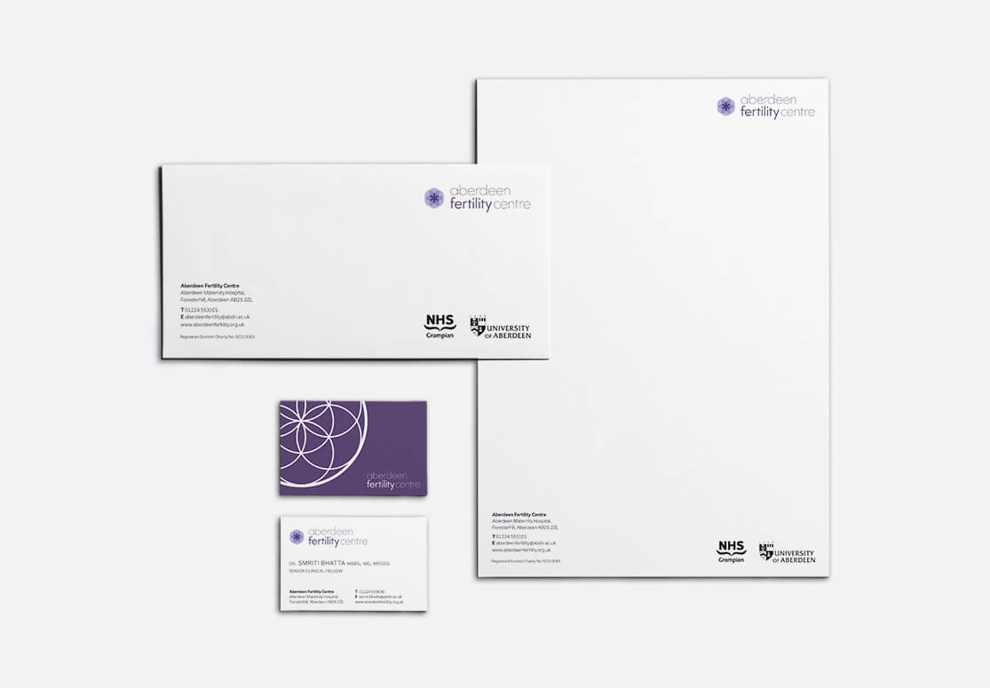
Aberdeen Fertility Centre sought an identity which was soft and welcoming, staying away from clichés about fertility and pregnancy. With this in mind, we created the seed of life identity. Using sacred geometry as a representation for cell division in the early stages of pregnancy, combined with a light logotype that echoes the circular motif.
project summary
- Brand identity
- Graphic design
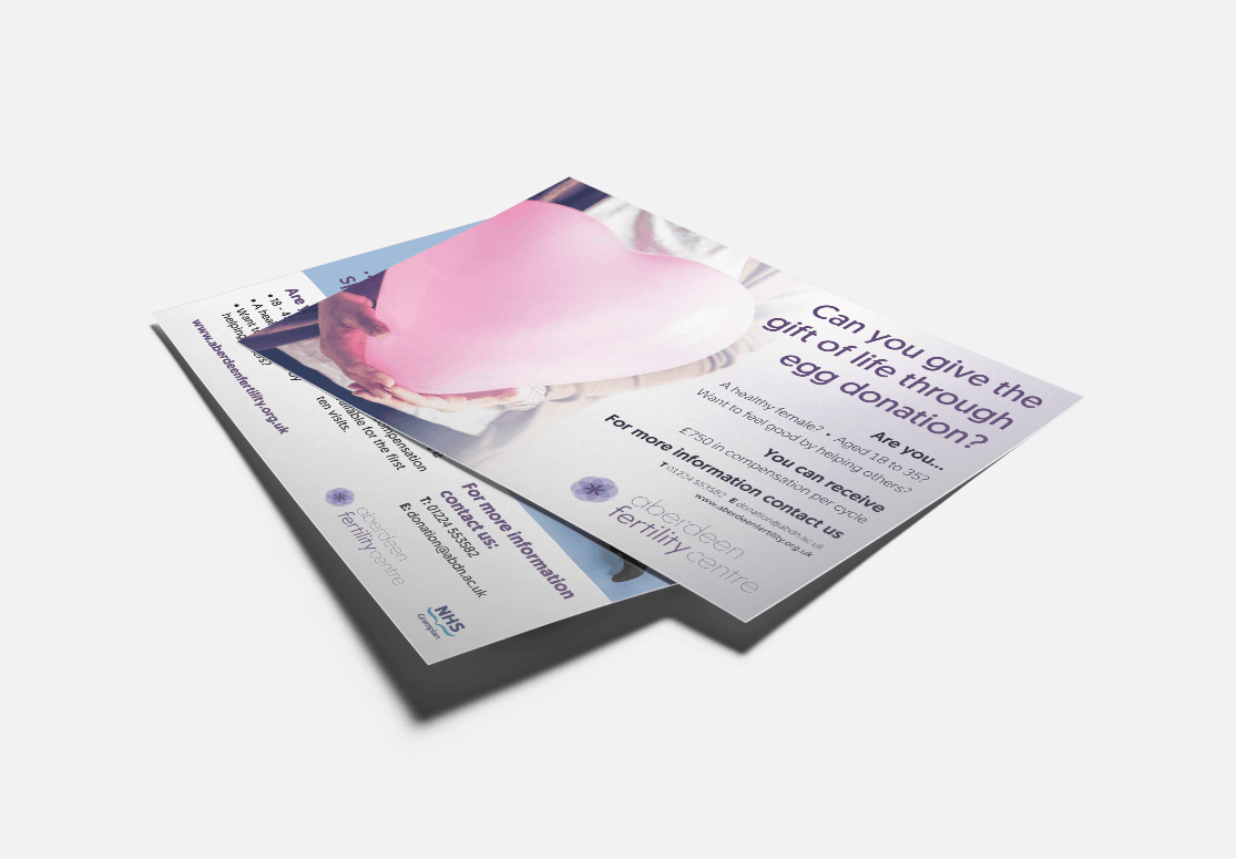
- Design for print
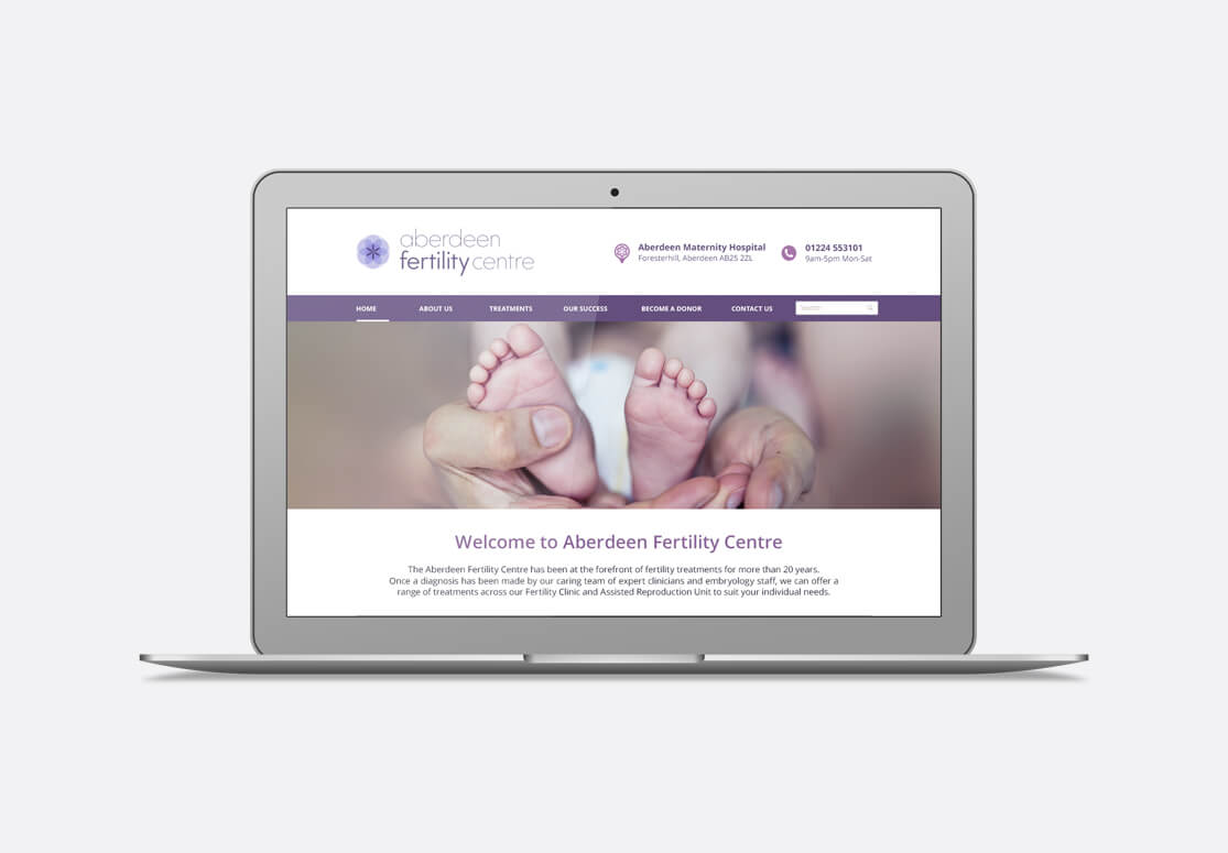
- Website design
more work